
When a practitioner tells me their website isn’t working, the conversation usually turns to colors, fonts, or whether the site looks dated. Those things matter eventually. But when a site isn’t bringing in new clients, the problem is almost always higher up the page, in the sentence at the very top.
A visitor gives your homepage a few seconds. In that time they need to answer two questions: what is this, and is it for me? If your headline doesn’t answer both, no amount of design will save the page.
Why Your Own Headline Is So Hard to Judge
You know your work too well. When you read your headline, you fill in all the context in your head: your training, your approach, the results you’ve seen. A stranger arrives with none of that. They only have the words on the screen.
Two habits show up again and again on practitioner websites, and both come from knowing too much.
Leading With How You Work
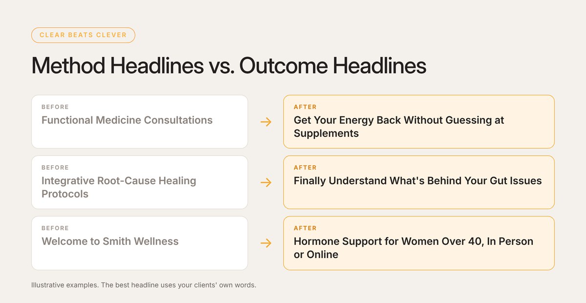
“Functional medicine consultations.” “Root-cause nutrition coaching.” These describe your method. But people rarely go looking for a method. They go looking for relief from something: low energy every afternoon, a gut that’s been off for a year, a diagnosis that came with no real plan. Lead with what changes for them. Your method is how you get there, and it belongs a little further down the page.
Writing for Your Colleagues
Clinical terms, certification acronyms, and modality names signal expertise to other practitioners. They also lose the people who actually book. If the only person likely to be impressed by your headline works in your field, it’s time for a rewrite.
A Simple Formula That Works
You don’t need to be clever. A clear headline usually has two parts, sometimes three: who it’s for, what changes for them, and (optionally) how you do it differently. For example: “Hormone support for women over 40, with a plan built around your own labs.”
Under it, add one button that says what happens next, like “Book a Free Call” or “Start Your Intake.” Not “Learn More.” Learn more about what?
Clear beats clever. A plain sentence people understand will outperform a beautiful one they have to decode.
How to Test It Without Guessing
Since you can’t judge your own headline, borrow someone else’s eyes. Pick a friend or neighbor who doesn’t know much about your business. Show them your homepage on your phone for about five seconds, then put the phone away and ask three questions:
- What does this business help with?
- Who do you think it’s for?
- What would you tap next?
If their answers don’t match what you’d say, you’ve found your fix. And it costs nothing but a rewrite.
5 Signs Your Headline Needs Work
- It’s your business name or a tagline. Your logo already says who you are. The headline should say what you do for people.
- It names a modality instead of a problem. Visitors look for help with something specific, not for a type of practitioner.
- It uses words your clients never say. If you wouldn’t hear it on a discovery call, it doesn’t belong at the top of the page.
- The button under it says “Learn More.” Tell people exactly what they’re signing up for.
- People email to ask what you actually do. That’s the clearest signal there is.
Not sure how yours stacks up? Sometimes one outside opinion is all it takes to see it.
I’ve spent more than 22 years building websites for health practitioners and wellness brands. Some of the biggest jumps in new inquiries I’ve seen came from changes that took an afternoon: a clearer headline, one obvious button, a real photo. A redesign can be the right call, but it works best after you know exactly what the page needs to say.
If you’d like a fresh read on your homepage, send me the link. I’ll tell you what’s working, what I’d fix first, and the simplest way to do it.